
My boys have suddenly got into Dungeons and Dragons
and I got the job of painting up the figures.
So far I have only completed two but it lots of fun
painting them up and getting a blast from the past
at the same time.
Redgar is a mighty Human Fighter and Jozan is a cleric.
I shall attempt Lidda and Mialee next.
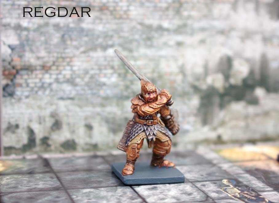


28mm is not my usual figure painting size and I think it
still needs a bit of work ?

Awesome! It’s great when the kids want to get involved 🙂 Lovely figure choice and such a neat paint job – kudos for doing the eyes, and the silver is beautifully done. They do lose a bit of impact at a distance though, so if I may be so bold as to offer some advice, you might want to think about this:
1: Push the contrasts… The gold and the leather on the mace handle for the cleric are both very similar in tone to the flesh, so you lose that ‘pop’ at arm’s length when these colours are right next to each other. The mace handle should be easy enough to darken, but the fighter would be more problematic… you could reverse the metals on him, (i.e. silver armour, gold scale), or go for a non-Caucasian skin tone?
2: It is generally a good idea to include a primary (or secondary) colour – again, this adds to the visual impact at a distance. The cloth colour you have chosen is again similar in tone to the other parts, and so tends to blend together at a distance. Using a crisp red, blue or green on the cloth parts of each would work wonders for both I suspect. Some colours (red, yellow, orange) ‘warm’ the model, whereas others (blues & greens) ‘cool’ it… you can use this to great effect to add character to any mini. You could use the same colour across the group to visually tie them together, or you could let the gold do that for you and let each son choose his favourite bold colour for his hero 😉
3: ‘Bases and Faces’ are the two parts of the model that draw the eye the most – your faces are fine, but you might want to add some interest to the bases for extra oomph. A bit of texture and lighter drybrush would really lift them for very little effort.
I hope this is accepted in the spirit intended mate – colour choice and contrast is more than half the battle at 28mm. Just a few tweaks here and there, and your super neat style will elevate these minis no end! 🙂
Any help is greatly received sir.
I like them. They look good and they are not cross-eyed. Consider adding some shading. Water down black paint to form a dark wash. Keep the application tight to those areas under or behind bordering details or between where two colors meet. Don’t wash over the entire model, only those crevasses and indentations where light would be less likely.
To be honest they were only suppose to be table top standard but I will take all the points on board and go the extra mile on the next model.